| Wed | 9am – 5:30pm |
| Thu | 9am – 5:30pm |
| Fri | 9am – 7pm |
| Sat | 9am – 5pm |
| Sun | 10am – 5pm |
| Mon | 9am – 8pm |
| Tue | 9am – 8pm |
Ask our staff anything about our shop or products, or share your feedback.
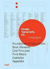
Why does a newspaper look different than a magazine or a book? What effect does using a certain typeface or a specific grid have? And why do some layouts just seem right, and others seem simply wrong? Richly illustrated with numerous examples from around the world, this comprehensive handbook and reference volume addresses the most important aspects of good book, poster and advert design, offering guidance on everything from building a website and the correct use of colors and fonts through to column width and line length.
Sketches and clarifying text serve to explain technical terms that are indispensable to understanding the interface of designing and producing print media.


