| Sun | 10am – 5pm |
| Mon | 9am – 5:30pm |
| Tue | 9am – 5:30pm |
| Wed | 9am – 5:30pm |
| Thu | 9am – 5:30pm |
| Fri | 9am – 7pm |
| Sat | 9am – 5pm |
Ask our staff anything about our shop or products, or share your feedback.

PublishedNew Riders, November 2012 |
ISBN9780321834737 |
FormatSoftcover, 384 pages |
Dimensions22.8cm × 17.9cm × 1.9cm |
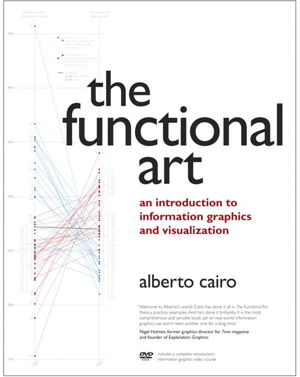
Unlike any time before in our lives, we have access to vast amounts of free information. With the right tools, we can start to make sense of all this data to see patterns and trends that would otherwise be invisible to us. By transforming numbers into graphical shapes, we allow readers to understand the stories those numbers hide.
In this practical introduction to understanding and using information graphics, you'll learn how to use data visualizations as tools to see beyond lists of numbers and variables and achieve new insights into the complex world around us. Regardless of the kind of data you're working with-business, science, politics, sports, or even your own personal finances-this book will show you how to use statistical charts, maps, and explanation diagrams to spot the stories in the data and learn new things from it.
You'll also get to peek into the creative process of some of the world's most talented designers and visual journalists, including Conde Nast Traveler's John Grimwade, National Geographic Magazine's Fernando Baptista, The New York Times' Steve Duenes, The Washington Post's Hannah Fairfield, Hans Rosling of the Gapminder Foundation, Stanford's Geoff McGhee, and European superstars Moritz Stefaner, Jan Willem Tulp, Stefanie Posavec, and Gregor Aisch. The book also includes a DVD-ROM containing over 90 minutes of video lessons that expand on core concepts explained within the book and includes even more inspirational information graphics from the world's leading designers.
The first book to offer a broad, hands-on introduction to information graphics and visualization, The Functional Art reveals:
Why data visualization should be thought of as "functional art" rather than fine art
How to use color, type, and other graphic tools to make your information graphics more effective, not just better looking
The science of how our brains perceive and remember information
Best practices for creating interactive information graphics
A comprehensive look at the creative process behind successful information graphics
An extensive gallery of inspirational work from the world's top designers and visual artists On the DVD-ROM: In this introductory video course on information graphics, Alberto Cairo goes into greater detail with even more visual examples of how to create effective information graphics that function as practical tools for aiding perception. You'll learn how to: incorporate basic design principles in your visualizations, create simple interfaces for interactive graphics, and choose the appropriate type of graphic forms for your data.
Cairo also deconstructs successful information graphics from The New York Times and National Geographic magazine with sketches and images not shown in the book.

